R 语言 ggplot2 图形高级定制与美化技巧
基础环境配置与绘图准备
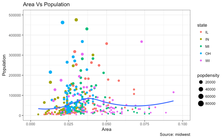
在进行高级绘图定制之前,首先需要加载必要的库并设定全局主题。以下代码展示了如何初始化环境并构建基础散点图。
# 设置科学计数法选项
options(scipen = 999)
library(ggplot2)

# 加载内置数据集
data("midwest", package = "ggplot2")

# 设定全局主题为黑白风格
theme_set(theme_bw())

# 构建基础图形对象
base_plot <- ggplot(midwest, aes(x = area, y = poptotal)) +
  geom_point(aes(color = state, size = popdensity)) +
  geom_smooth(method = "loess", se = FALSE) +
  xlim(c(0, 0.1)) +
  ylim(c(0, 500000)) +
  labs(title = "区域面积与人口总数关系", y = "人口总数", x = "区域面积", caption = "数据来源:midwest")

# 渲染图形
print(base_plot)
主题元素详解
theme() 函数通过特定的辅助函数来控制图形元素的样式,主要分为以下四类:
element_text():用于控制文本元素,如标题、副标题及注释。element_line():用于控制线条元素,如坐标轴线、主次网格线。element_rect():用于控制矩形区域,如绘图背景、面板背景。element_blank():用于隐藏特定的主题元素。
1. 标题与坐标轴文本样式调整
由于标题属于文本元素,需使用 element_text() 进行修饰。可以通过调整字体大小、家族、颜色及对齐方式来优化视觉效果。
library(ggplot2)

# 复用基础图形
base_plot <- ggplot(midwest, aes(x = area, y = poptotal)) +
  geom_point(aes(color = state, size = popdensity)) +
  geom_smooth(method = "loess", se = FALSE) +
  xlim(c(0, 0.1)) +
  ylim(c(0, 500000)) +
  labs(title = "区域面积与人口总数关系", y = "人口总数", x = "区域面积", caption = "数据来源:midwest")

# 应用自定义主题样式
styled_plot <- base_plot + theme(
    plot.title = element_text(size = 20,
                              face = "bold",
                              family = "sans",
                              color = "crimson",
                              hjust = 0.5,
                              lineheight = 1.2),
    plot.subtitle = element_text(size = 15,
                                 family = "sans",
                                 face = "bold",
                                 hjust = 0.5),
    plot.caption = element_text(size = 15),
    axis.title.x = element_text(vjust = 10, size = 15),
    axis.title.y = element_text(size = 15),
    axis.text.x = element_text(size = 10, angle = 30, vjust = .5),
    axis.text.y = element_text(size = 10)
)
print(styled_plot)
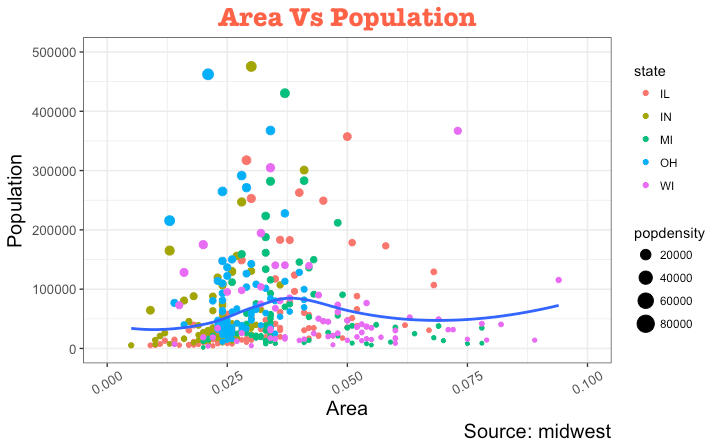
vjust:控制标题或标签与图形之间的垂直间距。hjust:控制水平间距,设置为 0.5 可实现居中对齐。family:指定字体家族。face:设置字体样式(如"plain", "italic", "bold")。
2. 图例定制化
当美学映射(如 fill, size, col)基于数据列时,图例会自动生成。以下介绍几种修改图例的方法。
修改图例标题
方法一:使用 labs()
library(ggplot2)
base_plot <- ggplot(midwest, aes(x = area, y = poptotal)) +
  geom_point(aes(color = state, size = popdensity)) +
  geom_smooth(method = "loess", se = FALSE) +
  xlim(c(0, 0.1)) + ylim(c(0, 500000)) +
  labs(title = "区域面积与人口总数关系", y = "人口总数", x = "区域面积", caption = "数据来源:midwest")

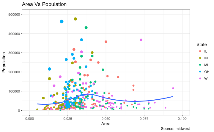
base_plot + labs(color = "州名", size = "人口密度")
方法二:使用 guides()
library(ggplot2)
base_plot <- ggplot(midwest, aes(x = area, y = poptotal)) +
  geom_point(aes(color = state, size = popdensity)) +
  geom_smooth(method = "loess", se = FALSE) +
  xlim(c(0, 0.1)) + ylim(c(0, 500000)) +
  labs(title = "区域面积与人口总数关系", y = "人口总数", x = "区域面积", caption = "数据来源:midwest")

final_plot <- base_plot + guides(color = guide_legend("州名"), size = guide_legend("人口密度"))
print(final_plot)
方法三:使用 scale_* 函数
可以通过设置 guide = FALSE 来隐藏特定变量的图例。
library(ggplot2)
base_plot <- ggplot(midwest, aes(x = area, y = poptotal)) +
  geom_point(aes(color = state, size = popdensity)) +
  geom_smooth(method = "loess", se = FALSE) +
  xlim(c(0, 0.1)) + ylim(c(0, 500000)) +
  labs(title = "区域面积与人口总数关系", y = "人口总数", x = "区域面积", caption = "数据来源:midwest")

base_plot + scale_color_discrete(name = "州名") + scale_size_continuous(name = "人口密度", guide = FALSE)
修改图例标签与颜色
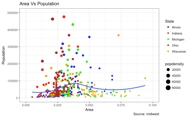
使用 scale_*_manual() 函数可以手动指定标签文本和颜色值。
library(ggplot2)
base_plot <- ggplot(midwest, aes(x = area, y = poptotal)) +
  geom_point(aes(color = state, size = popdensity)) +
  geom_smooth(method = "loess", se = FALSE) +
  xlim(c(0, 0.1)) + ylim(c(0, 500000)) +
  labs(title = "区域面积与人口总数关系", y = "人口总数", x = "区域面积", caption = "数据来源:midwest")

base_plot + scale_color_manual(name = "州名",
                        labels = c("伊利诺伊", "印第安纳", "密歇根", "俄亥俄", "威斯康星"),
                        values = c("IL" = "steelblue", "IN" = "firebrick", "MI" = "forestgreen", "OH" = "goldenrod", "WI" = "purple"))
调整图例顺序
通过 guides() 中的 order 参数控制图例显示的先后顺序。
library(ggplot2)
base_plot <- ggplot(midwest, aes(x = area, y = poptotal)) +
  geom_point(aes(color = state, size = popdensity)) +
  geom_smooth(method = "loess", se = FALSE) +
  xlim(c(0, 0.1)) + ylim(c(0, 500000)) +
  labs(title = "区域面积与人口总数关系", y = "人口总数", x = "区域面积", caption = "数据来源:midwest")

base_plot + guides(colour = guide_legend(order = 1), size = guide_legend(order = 2))
图例样式细节
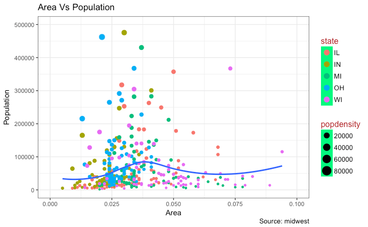
图例的键值区域视为矩形元素,可使用 element_rect() 调整背景,使用 element_text() 调整文本。
library(ggplot2)
base_plot <- ggplot(midwest, aes(x = area, y = poptotal)) +
  geom_point(aes(color = state, size = popdensity)) +
  geom_smooth(method = "loess", se = FALSE) +
  xlim(c(0, 0.1)) + ylim(c(0, 500000)) +
  labs(title = "区域面积与人口总数关系", y = "人口总数", x = "区域面积", caption = "数据来源:midwest")

base_plot + theme(legend.title = element_text(size = 12, color = "darkred"),
           legend.text = element_text(size = 10),
           legend.key = element_rect(fill = 'lightgreen')) +
  guides(colour = guide_legend(override.aes = list(size = 2, stroke = 1.5)))
图例位置与隐藏
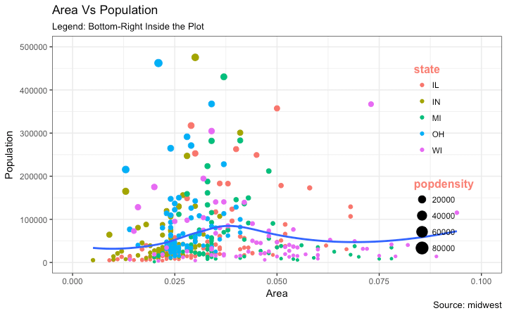
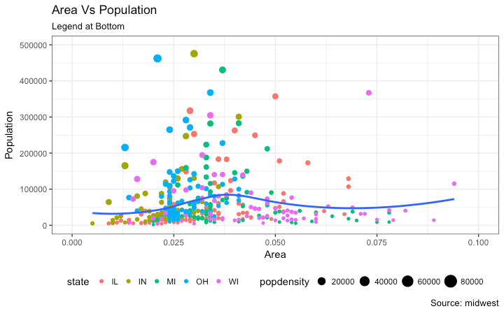
使用 theme() 控制图例位置。若需将图例置于图形内部,需配合 legend.justification 调整锚点。
library(ggplot2)
base_plot <- ggplot(midwest, aes(x = area, y = poptotal)) +
  geom_point(aes(color = state, size = popdensity)) +
  geom_smooth(method = "loess", se = FALSE) +
  xlim(c(0, 0.1)) + ylim(c(0, 500000)) +
  labs(title = "区域面积与人口总数关系", y = "人口总数", x = "区域面积", caption = "数据来源:midwest")

# 隐藏图例
base_plot + theme(legend.position = "none") + labs(subtitle = "无图例模式")

# 图例置于左侧
base_plot + theme(legend.position = "left") + labs(subtitle = "图例在左侧")

# 图例置于底部且水平排列
base_plot + theme(legend.position = "bottom", legend.box = "horizontal") + labs(subtitle = "图例在底部")

# 图例置于内部右下角
base_plot + theme(legend.title = element_text(size = 12, color = "salmon", face = "bold"),
           legend.justification = c(1, 0),
           legend.position = c(0.95, 0.05),
           legend.background = element_blank(),
           legend.key = element_blank()) +
  labs(subtitle = "图例:内部右下角")

# 图例置于内部左上角
base_plot + theme(legend.title = element_text(size = 12, color = "salmon", face = "bold"),
           legend.justification = c(0, 1),
           legend.position = c(0.05, 0.95),
           legend.background = element_blank(),
           legend.key = element_blank()) +
  labs(subtitle = "图例:内部左上角")
3. 添加文本标注
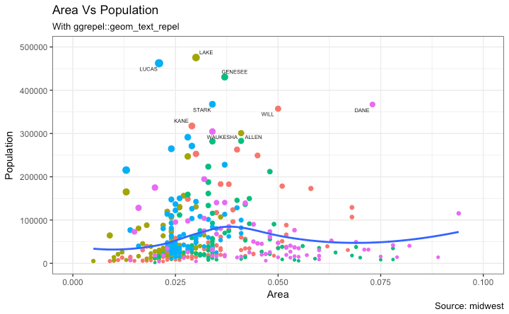
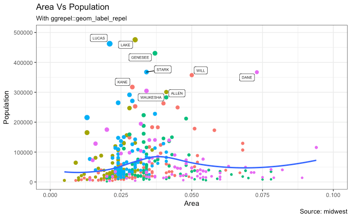
针对特定数据点(如人口超过 30 万的县)添加标签。建议结合 ggrepel 包以避免文本重叠。
library(ggplot2)

# 筛选数据
midwest_sub <- midwest[midwest$poptotal > 300000, ]
midwest_sub$large_county <- ifelse(midwest_sub$poptotal > 300000, midwest_sub$county, "")

base_plot <- ggplot(midwest, aes(x = area, y = poptotal)) +
  geom_point(aes(color = state, size = popdensity)) +
  geom_smooth(method = "loess", se = FALSE) +
  xlim(c(0, 0.1)) + ylim(c(0, 500000)) +
  labs(title = "区域面积与人口总数关系", y = "人口总数", x = "区域面积", caption = "数据来源:midwest")

# 普通文本标注
base_plot + geom_text(aes(label = large_county), size = 2, data = midwest_sub) + labs(subtitle = "使用 geom_text") + theme(legend.position = "none")

# 带框文本标注
base_plot + geom_label(aes(label = large_county), size = 2, data = midwest_sub, alpha = 0.25) + labs(subtitle = "使用 geom_label") + theme(legend.position = "none")

# 防重叠文本标注 (需安装 ggrepel)
library(ggrepel)
base_plot + geom_text_repel(aes(label = large_county), size = 2, data = midwest_sub) + labs(subtitle = "使用 ggrepel") + theme(legend.position = "none")

base_plot + geom_label_repel(aes(label = large_county), size = 2, data = midwest_sub) + labs(subtitle = "使用 ggrepel label") + theme(legend.position = "none")
4. 自定义注释
使用 annotation_custom() 可以在图中任意位置添加图形对象(grob)。
library(ggplot2)
base_plot <- ggplot(midwest, aes(x = area, y = poptotal)) +
  geom_point(aes(color = state, size = popdensity)) +
  geom_smooth(method = "loess", se = FALSE) +
  xlim(c(0, 0.1)) + ylim(c(0, 500000)) +
  labs(title = "区域面积与人口总数关系", y = "人口总数", x = "区域面积", caption = "数据来源:midwest")

library(grid)
info_text <- "此处为自定义注释文本!"
info_grob = grid.text(info_text, x = 0.7,  y = 0.8, gp = gpar(col = "darkred", fontsize = 14, fontface = "bold"))

base_plot + annotation_custom(info_grob)
5. 坐标轴变换
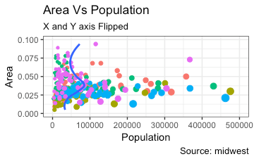
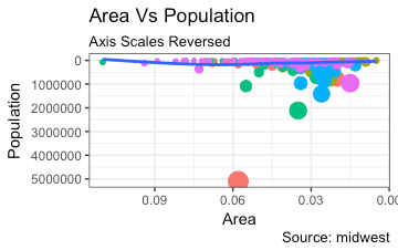
可以通过 coord_flip() 交换 X 和 Y 轴,或使用 scale_*_reverse() 逆转坐标轴方向。
library(ggplot2)
base_plot <- ggplot(midwest, aes(x = area, y = poptotal)) +
  geom_point(aes(color = state, size = popdensity)) +
  geom_smooth(method = "loess", se = FALSE) +
  xlim(c(0, 0.1)) + ylim(c(0, 500000)) +
  labs(title = "区域面积与人口总数关系", y = "人口总数", x = "区域面积", caption = "数据来源:midwest", subtitle = "坐标轴翻转") + theme(legend.position = "none")

# 翻转坐标轴
base_plot + coord_flip()
library(ggplot2)
base_plot <- ggplot(midwest, aes(x = area, y = poptotal)) +
  geom_point(aes(color = state, size = popdensity)) +
  geom_smooth(method = "loess", se = FALSE) +
  xlim(c(0, 0.1)) + ylim(c(0, 500000)) +
  labs(title = "区域面积与人口总数关系", y = "人口总数", x = "区域面积", caption = "数据来源:midwest", subtitle = "坐标轴逆转") + theme(legend.position = "none")

# 逆转坐标轴
base_plot + scale_x_reverse() + scale_y_reverse()
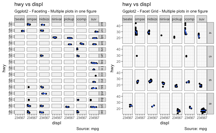
6. 分面绘图:多图布局
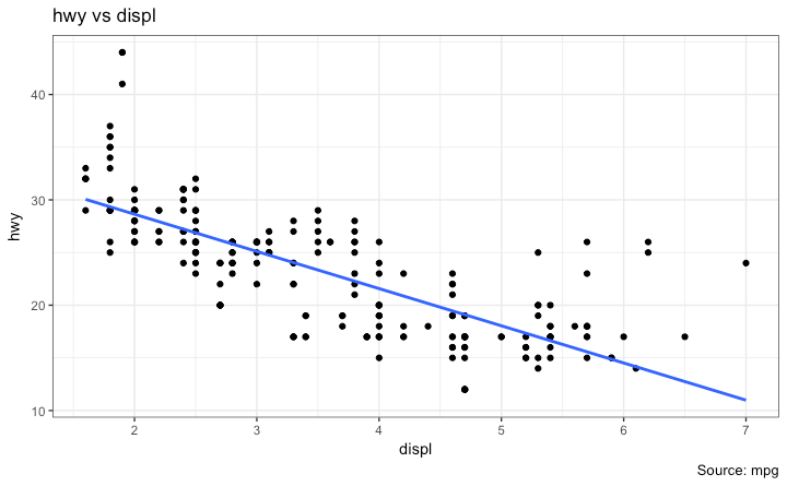
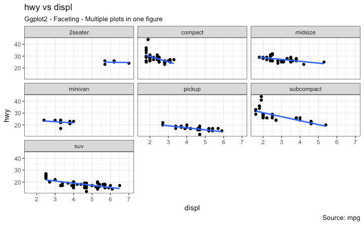
使用分面功能可以在一个图形窗口中展示多个子图。以下使用 mpg 数据集演示。
library(ggplot2)
data(mpg, package = "ggplot2")

vehicle_plot <- ggplot(mpg, aes(x = displ, y = hwy)) +
      geom_point() +
      labs(title = "高速里程 vs 发动机排量", caption = "数据来源:mpg") +
      geom_smooth(method = "lm", se = FALSE) +
      theme_bw()
print(vehicle_plot)
Facet Wrap
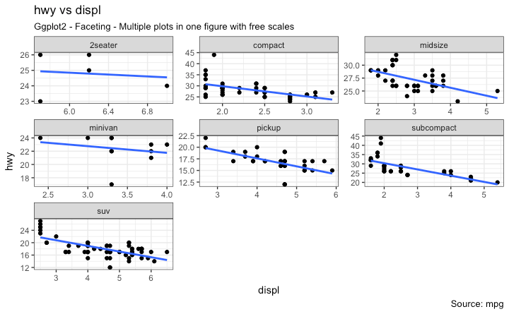
默认情况下所有子图共享坐标轴尺度,可通过 scales = 'free' 释放约束。
library(ggplot2)
vehicle_plot <- ggplot(mpg, aes(x = displ, y = hwy)) +
      geom_point() +
      geom_smooth(method = "lm", se = FALSE) +
      theme_bw()

# 共享尺度
vehicle_plot + facet_wrap(~ class, nrow = 3) + labs(title = "高速里程 vs 发动机排量", caption = "数据来源:mpg", subtitle = "共享坐标轴尺度")

# 自由尺度
vehicle_plot + facet_wrap(~ class, scales = "free") + labs(title = "高速里程 vs 发动机排量", caption = "数据来源:mpg", subtitle = "自由坐标轴尺度")
Facet Grid
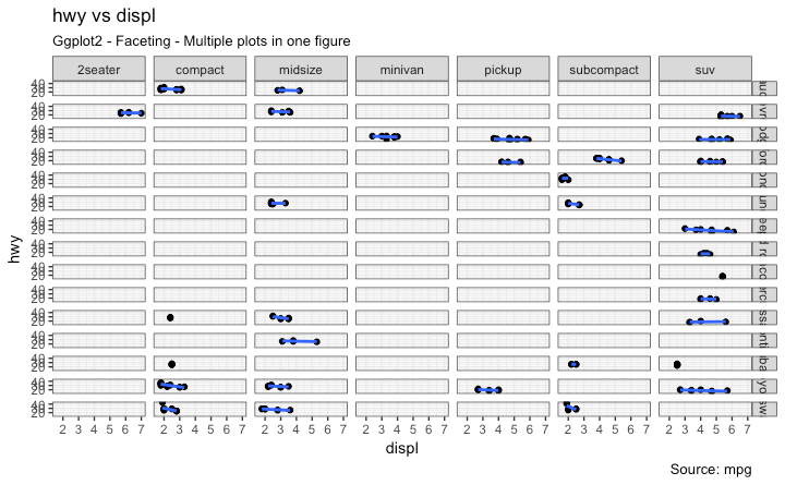
facet_grid() 允许通过公式定义行和列的分组变量。
library(ggplot2)
vehicle_plot <- ggplot(mpg, aes(x = displ, y = hwy)) +
      geom_point() +
      labs(title = "高速里程 vs 发动机排量", caption = "数据来源:mpg", subtitle = "分面网格布局") +
      geom_smooth(method = "lm", se = FALSE) +
      theme_bw()

# 行:manufacturer, 列:class
grid_plot <- vehicle_plot + facet_grid(manufacturer ~ class)
print(grid_plot)
若需将多个独立图形排列在同一面板中,可使用 gridExtra 包。
library(gridExtra)
gridExtra::grid.arrange(grid_plot, vehicle_plot, ncol = 2)
7. 背景与网格线定制
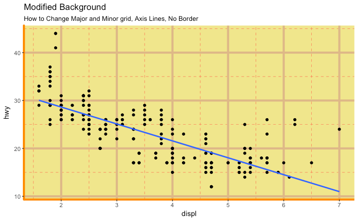
修改背景元素
library(ggplot2)
vehicle_plot <- ggplot(mpg, aes(x = displ, y = hwy)) +
      geom_point() +
      geom_smooth(method = "lm", se = FALSE) +
      theme_bw()

# 修改面板背景与网格
vehicle_plot + theme(panel.background = element_rect(fill = 'khaki'),
          panel.grid.major = element_line(colour = "burlywood", size = 1.5),
          panel.grid.minor = element_line(colour = "tomato", size = .25, linetype = "dashed"),
          panel.border = element_blank(),
          axis.line.x = element_line(colour = "darkorange", size = 1.5, lineend = "butt"),
          axis.line.y = element_line(colour = "darkorange", size = 1.5)) +
    labs(title = "背景定制", subtitle = "修改网格线与坐标轴")

# 修改绘图边距
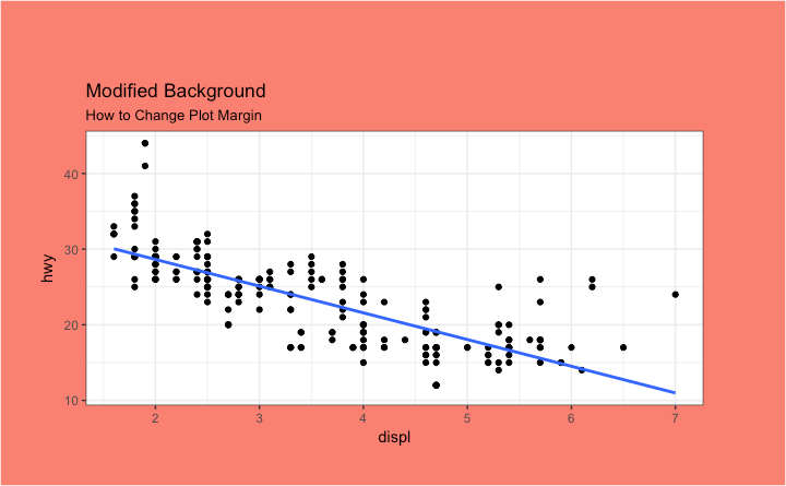
vehicle_plot + theme(plot.background = element_rect(fill = "salmon"),
          plot.margin = unit(c(2, 2, 1, 1), "cm")) +
    labs(title = "边距定制", subtitle = "修改绘图外边距")
移除网格与边框
library(ggplot2)
vehicle_plot <- ggplot(mpg, aes(x = displ, y = hwy)) +
      geom_point() +
      geom_smooth(method = "lm", se = FALSE) +
      theme_bw()

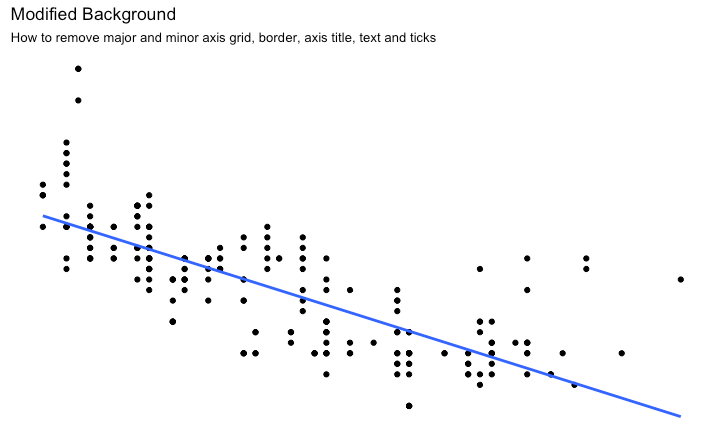
vehicle_plot + theme(panel.grid.major = element_blank(),
          panel.grid.minor = element_blank(),
          panel.border = element_blank(),
          axis.title = element_blank(),
          axis.text = element_blank(),
          axis.ticks = element_blank()) +
  labs(title = "极简风格", subtitle = "移除网格、边框及刻度")
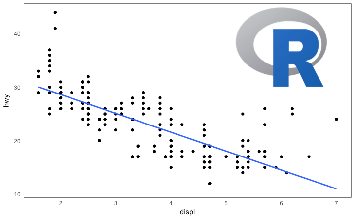
背景中添加图片
library(ggplot2)
library(grid)
library(png)

# 读取图片 (需确保路径存在)
# img <- png::readPNG("screenshots/Rlogo.png")
# g_pic <- rasterGrob(img, interpolate = TRUE)

vehicle_plot <- ggplot(mpg, aes(x = displ, y = hwy)) +
      geom_point() +
      geom_smooth(method = "lm", se = FALSE) +
      theme_bw()

# 假设 g_pic 已定义
# vehicle_plot + theme(panel.grid.major = element_blank(),
#           panel.grid.minor = element_blank(),
#           plot.title = element_text(size = rel(1.5), face = "bold"),
#           axis.ticks = element_blank()) +
#   annotation_custom(g_pic, xmin = 5, xmax = 7, ymin = 30, ymax = 45)
8. 主题组件继承结构
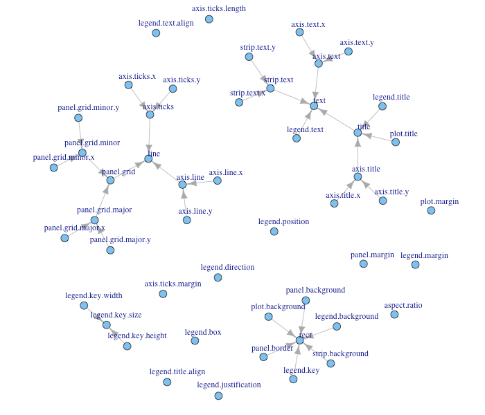
理解主题元素的继承关系有助于更高效地进行样式定制。