基于 Flutter for OpenHarmony 构建手语教学应用的学习中心模块
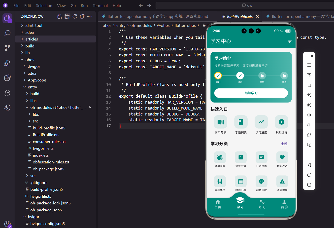
学习中心作为手语教学应用的核心枢纽,承担着展示学习进度、课程分类导航以及历史记录追溯等关键职责。本文将详细解析如何从零构建一个高内聚、低耦合的学习看板,涵盖进度可视化、网格化分类、横向瀑布流以及多维条件过滤等工程实践。
视图骨架与全局布局
为了应对后续可能增加的复杂交互状态(如动态筛选),我们将主视图定义为 StatefulWidget。全局采用 CustomScrollView 替代传统的 SingleChildScrollView 嵌套,以获得更优的滑动性能和统一的吸顶效果。
class StudyHubPage extends StatefulWidget {
  const StudyHubPage({super.key});

  @override
  State<StudyHubPage> createState() => _StudyHubPageState();
}

class _StudyHubPageState extends State<StudyHubPage> {
  @override
  Widget build(BuildContext context) {
    final screenSize = MediaQuery.sizeOf(context);
    final horizontalPadding = screenSize.width * 0.04;

    return Scaffold(
      backgroundColor: const Color(0xFFF8F9FA),
      appBar: AppBar(
        title: const Text('探索与学习'),
        elevation: 0,
        actions: [
          IconButton(
            icon: const Icon(Icons.tune_rounded),
            onPressed: _presentFilterSheet,
          ),
        ],
      ),
      body: CustomScrollView(
        slivers: [
          SliverToBoxAdapter(child: _buildRoadmapCard(screenSize)),
          SliverPadding(
            padding: EdgeInsets.all(horizontalPadding),
            sliver: _buildCategoryMatrix(),
          ),
          SliverToBoxAdapter(child: _buildRecentActivity(screenSize)),
          SliverPadding(
            padding: EdgeInsets.all(horizontalPadding),
            sliver: _buildCourseCatalog(),
          ),
        ],
      ),
    );
  }
}
通过引入 MediaQuery 获取屏幕物理尺寸,并基于比例计算边距,从而彻底摆脱对第三方屏幕适配插件的依赖。
进度可视化:学习路线图
顶部的学习路线图需要具备强烈的视觉引导性。我们采用深色渐变背景配合高亮节点来渲染当前的学习阶段。节点状态通过 Dart 3 的枚举和模式匹配来驱动 UI 变更。
enum NodeStatus { locked, active, completed }

Widget _buildRoadmapCard(Size screenSize) {
  return Container(
    margin: EdgeInsets.all(screenSize.width * 0.04),
    padding: EdgeInsets.all(screenSize.width * 0.05),
    decoration: BoxDecoration(
      gradient: const LinearGradient(
        colors: [Color(0xFF1E3A8A), Color(0xFF3B82F6)],
        begin: Alignment.topLeft,
        end: Alignment.bottomRight,
      ),
      borderRadius: BorderRadius.circular(20),
    ),
    child: Column(
      crossAxisAlignment: CrossAxisAlignment.start,
      children: [
        const Text('专属学习路径', style: TextStyle(color: Colors.white, fontSize: 20, fontWeight: FontWeight.bold)),
        const SizedBox(height: 8),
        const Text('系统化掌握手语表达技巧', style: TextStyle(color: Colors.white70)),
        const SizedBox(height: 24),
        Row(
          mainAxisAlignment: MainAxisAlignment.spaceBetween,
          children: [
            _RoadmapNode(label: '入门', status: NodeStatus.completed),
            _Connector(isActive: true),
            _RoadmapNode(label: '基础', status: NodeStatus.active),
            _Connector(isActive: false),
            _RoadmapNode(label: '进阶', status: NodeStatus.locked),
            _Connector(isActive: false),
            _RoadmapNode(label: '熟练', status: NodeStatus.locked),
          ],
        ),
        const SizedBox(height: 24),
        SizedBox(
          width: double.infinity,
          child: ElevatedButton(
            onPressed: () {},
            style: ElevatedButton.styleFrom(
              backgroundColor: Colors.white,
              foregroundColor: const Color(0xFF1E3A8A),
              shape: RoundedRectangleBorder(borderRadius: BorderRadius.circular(12)),
            ),
            child: const Text('继续当前课程'),
          ),
        ),
      ],
    ),
  );
}
将单个节点提取为独立的无状态组件 _RoadmapNode,利用 switch 表达式决定图标和背景色的渲染逻辑,保证了组件的高内聚。
class _RoadmapNode extends StatelessWidget {
  final String label;
  final NodeStatus status;

  const _RoadmapNode({required this.label, required this.status});

  @override
  Widget build(BuildContext context) {
    final (icon, bgColor, borderColor) = switch (status) {
      NodeStatus.completed => (Icons.check_rounded, Colors.white, Colors.transparent),
      NodeStatus.active => (Icons.play_arrow_rounded, Colors.white, Colors.amber),
      NodeStatus.locked => (Icons.lock_rounded, Colors.white24, Colors.transparent),
    };

    return Column(
      children: [
        Container(
          width: 40,
          height: 40,
          decoration: BoxDecoration(
            color: bgColor,
            shape: BoxShape.circle,
            border: Border.all(color: borderColor, width: 2.5),
          ),
          child: Icon(icon, color: status == NodeStatus.locked ? Colors.white54 : const Color(0xFF1E3A8A)),
        ),
        const SizedBox(height: 6),
        Text(label, style: const TextStyle(color: Colors.white, fontSize: 12)),
      ],
    );
  }
}

class _Connector extends StatelessWidget {
  final bool isActive;
  const _Connector({required this.isActive});

  @override
  Widget build(BuildContext context) {
    return Expanded(
      child: Container(
        height: 2,
        margin: const EdgeInsets.only(bottom: 20),
        color: isActive ? Colors.white : Colors.white24,
      ),
    );
  }
}
课程分类矩阵
分类区域采用数据驱动的方式构建。定义结构化的数据模型,并使用 SliverGrid 实现高性能的网格布局。
class CategoryEntity {
  final String title;
  final IconData icon;
  final int courseCount;
  const CategoryEntity(this.title, this.icon, this.courseCount);
}

SliverGrid _buildCategoryMatrix() {
  final categories = [
    const CategoryEntity('日常问候', Icons.waving_hand, 15),
    const CategoryEntity('数字表达', Icons.pin, 20),
    const CategoryEntity('情感交流', Icons.favorite_border, 25),
    const CategoryEntity('家庭成员', Icons.people_outline, 12),
    const CategoryEntity('紧急求助', Icons.error_outline, 8),
    const CategoryEntity('时间日期', Icons.schedule, 18),
    const CategoryEntity('颜色认知', Icons.palette_outlined, 14),
    const CategoryEntity('职场用语', Icons.work_outline, 22),
  ];

  return SliverGrid(
    gridDelegate: const SliverGridDelegateWithFixedCrossAxisCount(
      crossAxisCount: 4,
      mainAxisSpacing: 16,
      crossAxisSpacing: 12,
      childAspectRatio: 0.85,
    ),
    delegate: SliverChildBuilderDelegate(
      (context, index) {
        final item = categories[index];
        return _CategoryTile(entity: item);
      },
      childCount: categories.length,
    ),
  );
}
每个分类卡片封装了点击事件与视觉呈现,文本超长截断处理保证了布局的稳定性。
class _CategoryTile extends StatelessWidget {
  final CategoryEntity entity;
  const _CategoryTile({required this.entity});

  @override
  Widget build(BuildContext context) {
    return GestureDetector(
      onTap: () {/* 路由跳转逻辑 */},
      child: Column(
        mainAxisAlignment: MainAxisAlignment.center,
        children: [
          Container(
            padding: const EdgeInsets.all(12),
            decoration: BoxDecoration(
              color: const Color(0xFF3B82F6).withOpacity(0.1),
              borderRadius: BorderRadius.circular(16),
            ),
            child: Icon(entity.icon, color: const Color(0xFF3B82F6), size: 28),
          ),
          const SizedBox(height: 8),
          Text(
            entity.title,
            maxLines: 1,
            overflow: TextOverflow.ellipsis,
            style: const TextStyle(fontSize: 13, fontWeight: FontWeight.w500),
          ),
        ],
      ),
    );
  }
}
历史记录横向轮播
为了在有限的垂直空间内展示更多内容,最近学习模块使用了带有分页物理效果的横向 ListView。
Widget _buildRecentActivity(Size screenSize) {
  final cardWidth = screenSize.width * 0.4;

  return Column(
    crossAxisAlignment: CrossAxisAlignment.start,
    children: [
      Padding(
        padding: EdgeInsets.symmetric(horizontal: screenSize.width * 0.04),
        child: const Text('最近学习', style: TextStyle(fontSize: 18, fontWeight: FontWeight.bold)),
      ),
      const SizedBox(height: 12),
      SizedBox(
        height: 120,
        child: ListView.builder(
          scrollDirection: Axis.horizontal,
          physics: const BouncingScrollPhysics(),
          padding: EdgeInsets.symmetric(horizontal: screenSize.width * 0.04),
          itemCount: 6,
          itemBuilder: (context, index) {
            return Container(
              width: cardWidth,
              margin: const EdgeInsets.only(right: 12),
              child: Card(
                elevation: 2,
                shape: RoundedRectangleBorder(borderRadius: BorderRadius.circular(16)),
                child: Center(child: Text('课程卡片 ${index + 1}')),
              ),
            );
          },
        ),
      ),
    ],
  );
}
全局课程目录与状态映射
底部列表通过状态管理库获取全量课程数据。在渲染难度标签时,废弃了冗长的 if-else 或 switch 语句,转而使用 Map 进行颜色字典映射,提升了代码的可读性与扩展性。
final _difficultyColors = {
  '入门': const Color(0xFF4CAF50),
  '初级': const Color(0xFF8BC34A),
  '中级': const Color(0xFFFF9800),
  '高级': const Color(0xFFF44336),
};

SliverList _buildCourseCatalog() {
  // 假设通过 Provider 或 Riverpod 获取数据
  final courses = [
    {'title': '手语字母表', 'category': '基础', 'duration': 15, 'difficulty': '入门'},
    {'title': '数字与计数', 'category': '基础', 'duration': 20, 'difficulty': '初级'},
    {'title': '复杂句型表达', 'category': '进阶', 'duration': 45, 'difficulty': '高级'},
  ];

  return SliverList(
    delegate: SliverChildBuilderDelegate(
      (context, index) {
        final course = courses[index];
        final levelColor = _difficultyColors[course['difficulty']] ?? Colors.grey;

        return Card(
          margin: const EdgeInsets.only(bottom: 12),
          child: ListTile(
            contentPadding: const EdgeInsets.symmetric(horizontal: 16, vertical: 8),
            leading: Container(
              width: 48,
              height: 48,
              decoration: BoxDecoration(
                color: levelColor.withOpacity(0.1),
                borderRadius: BorderRadius.circular(12),
              ),
              child: Icon(Icons.accessibility_new, color: levelColor),
            ),
            title: Text(course['title'] as String, style: const TextStyle(fontWeight: FontWeight.w600)),
            subtitle: Text('${course['category']} · ${course['duration']}分钟', style: const TextStyle(fontSize: 12)),
            trailing: Container(
              padding: const EdgeInsets.symmetric(horizontal: 10, vertical: 4),
              decoration: BoxDecoration(
                color: levelColor.withOpacity(0.15),
                borderRadius: BorderRadius.circular(20),
              ),
              child: Text(
                course['difficulty'] as String,
                style: TextStyle(color: levelColor, fontSize: 12, fontWeight: FontWeight.bold),
              ),
            ),
          ),
        );
      },
      childCount: courses.length,
    ),
  );
}
多维度过滤面板
筛选交互通过 showModalBottomSheet 唤起,内部使用 StatefulBuilder 来局部刷新选中状态,避免了整个学习中心页面的重绘。过滤维度拆分为难度与时长两组。
void _presentFilterSheet() {
  showModalBottomSheet(
    context: context,
    isScrollControlled: true,
    backgroundColor: Colors.transparent,
    builder: (ctx) {
      String selectedLevel = '全部';
      String selectedDuration = '全部';

      return StatefulBuilder(
        builder: (context, setModalState) {
          return Container(
            padding: const EdgeInsets.fromLTRB(20, 16, 20, 40),
            decoration: const BoxDecoration(
              color: Colors.white,
              borderRadius: BorderRadius.vertical(top: Radius.circular(24)),
            ),
            child: Column(
              mainAxisSize: MainAxisSize.min,
              crossAxisAlignment: CrossAxisAlignment.start,
              children: [
                const Text('精准筛选', style: TextStyle(fontSize: 18, fontWeight: FontWeight.bold)),
                const SizedBox(height: 20),
                const Text('难度级别', style: TextStyle(fontWeight: FontWeight.w500)),
                const SizedBox(height: 12),
                Wrap(
                  spacing: 10,
                  children: ['全部', '入门', '初级', '中级', '高级'].map((level) {
                    final isSelected = selectedLevel == level;
                    return FilterChip(
                      label: Text(level),
                      selected: isSelected,
                      selectedColor: const Color(0xFF3B82F6).withOpacity(0.2),
                      checkmarkColor: const Color(0xFF3B82F6),
                      onSelected: (_) => setModalState(() => selectedLevel = level),
                    );
                  }).toList(),
                ),
                const SizedBox(height: 20),
                const Text('课程时长', style: TextStyle(fontWeight: FontWeight.w500)),
                const SizedBox(height: 12),
                Wrap(
                  spacing: 10,
                  children: ['全部', '10分钟内', '10-30分钟', '30分钟以上'].map((duration) {
                    final isSelected = selectedDuration == duration;
                    return FilterChip(
                      label: Text(duration),
                      selected: isSelected,
                      selectedColor: const Color(0xFF3B82F6).withOpacity(0.2),
                      onSelected: (_) => setModalState(() => selectedDuration = duration),
                    );
                  }).toList(),
                ),
              ],
            ),
          );
        },
      );
    },
  );
}
在自适应布局层面,彻底摒弃了硬编码像素值,通过 MediaQuery.sizeOf(context) 动态计算边距(如 screenSize.width * 0.04)和卡片宽度。这种做法不仅保证了应用在 OpenHarmony 各种分辨率设备(如折叠屏、平板)上的比例一致性,同时降低了引入额外依赖包所带来的构建负担。