HarmonyOS6 RcInput 组件的架构设计与类型系统实现
引言
在 HarmonyOS6 的应用开发中,输入控件是构建用户交互的基础元素。原生 TextInput 虽然可用,但在复杂业务场景下常显不足,例如密码可见性切换、内容格式化、多类型适配等需求难以直接满足。为此,经过半年的迭代优化,我们设计并实现了 RcInput —— 一个功能完备、类型安全且高度可扩展的自定义输入组件。本文将深入解析其架构分层逻辑与类型系统的实现策略,帮助开发者掌握其背后的设计思想。
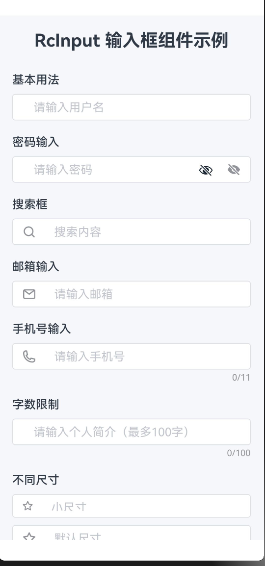
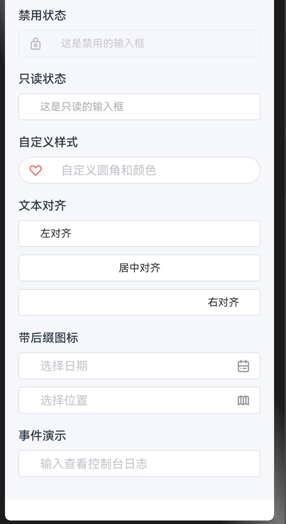
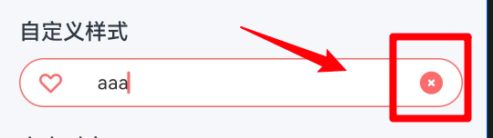
典型使用效果展示
整体架构设计
文件结构划分
RcInput 采用清晰的模块化组织方式,核心代码分为两个文件:
formComponents/RcInput/
├── index.ets         // 主体逻辑:UI 渲染、状态管理、事件响应
├── index.type.ets    // 类型定义:接口与联合类型的集中声明
└── README.md         // 使用说明文档
该结构实现了类型与实现的解耦。外部调用方可以仅导入 .type.ets 中的类型定义用于类型推导,而无需加载整个组件逻辑,提升编译效率和项目维护性。
组件模型与依赖引入
组件使用 @ComponentV2 装饰器声明,这是 HarmonyOS6 推荐的新一代组件范式。相较于旧版 @Component,@ComponentV2 结合 @Param 和 @Local 实现了更细粒度的响应式更新机制,有效避免不必要的全量重渲染。
import {
  RcInputType,
  RcInputSize,
  RcInputAlign,
  RcInputEnterKeyType,
  RcInputClearTrigger,
  RcInputFormatter,
  RcInputParser
} from './index.type'
import { RcStringNumber } from '../../model/Global.type'
import { getSizeByUnit } from '../../utils/utils'
import { RcIcon } from '../../basicsComponents/RcIcon/index'
import { RcIconDataType } from '../../basicsComponents/RcIcon/index.type'

@ComponentV2
export struct RcInput {
  // ...
}
其中:
@Param表示从父组件传入的属性;@Local管理组件内部私有状态;@Require标记必填参数,确保关键字段如value不被遗漏,从而在编译阶段捕获潜在错误。
参数分类与装饰器语义
| 装饰器 | 用途 | 示例 |
|---|---|---|
@Param @Require |
必须由父组件提供,否则编译报错 | value: string |
@Param |
可选参数,带默认值 | disabled: boolean = false |
@Local |
组件内部状态,不对外暴露 | isFocused: boolean = false |
类型系统设计详解
输入类型定义(RcInputType)
采用字符串字面量联合类型而非传统枚举:
// index.type.ets
export type RcInputType = 'text' | 'number' | 'password' | 'email' | 'tel' | 'url';
选择此方案的原因包括:
- 天然支持 JSON 序列化,无需额外转换;
- IDE 自动补全体验更好;
- 代码表达更直观,如
inputType: 'password'比RcInputType.PASSWORD更易读。
内部通过 getInputType() 方法映射为 ArkTS 原生类型,并处理"显示密码"这一特殊逻辑:
private getInputType(): InputType {
  if (this.inputType === 'password' && !this.showPasswordText) {
    return InputType.Password;
  }

  switch (this.inputType) {
    case 'number':   return InputType.Number;
    case 'email':    return InputType.Email;
    case 'tel':      return InputType.PhoneNumber;
    case 'password':
    case 'text':
    default:         return InputType.Normal;
  }
}
当启用"明文显示"时,虽然类型仍为 password,但实际输入模式降级为普通文本,使用户可见字符内容,同时保留原有键盘布局。
尺寸体系(RcInputSize)
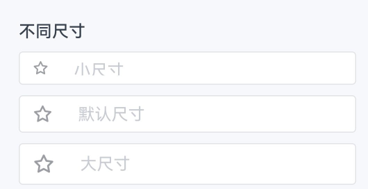
export type RcInputSize = 'small' | 'default' | 'large';
不同尺寸对应的具体样式如下:
| 尺寸 | 高度 | 字体大小 | 图标尺寸 |
|---|---|---|---|
| small | 32vp | 12vp | 16vp |
| default | 36vp | 可配置(默认14vp) | 可配置(默认20vp) |
| large | 40vp | 16vp | 22vp |
设计意图明确:small 与 large 是固定规格,保证视觉一致性;default 允许开发者根据需要调整字体和图标大小,提升灵活性。
文本对齐方式(RcInputAlign)
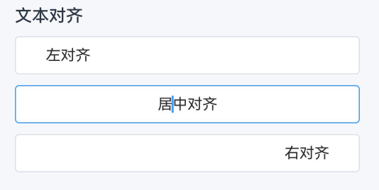
export type RcInputAlign = 'left' | 'center' | 'right';
ArkTS 使用 TextAlign.Start 和 TextAlign.End 支持 RTL(从右至左)语言布局。因此在内部进行语义转换:
private getTextAlign(): TextAlign {
  switch (this.textAlign) {
    case 'center': return TextAlign.Center;
    case 'right':  return TextAlign.End;
    case 'left':
    default:       return TextAlign.Start;
  }
}
这一抽象层屏蔽了底层 API 差异,使上层调用无需关心国际化细节。
清空按钮触发策略(RcInputClearTrigger)
export type RcInputClearTrigger = 'always' | 'focus';
是否显示清空按钮由以下逻辑控制:
private shouldShowClear(): boolean {
  if (!this.clearable || this.disabled || this.readonly) {
    return false;
  }

  if (this.clearTrigger === 'always') {
    return this.innerValue.length > 0;
  }

  return this.isFocused && this.innerValue.length > 0;
}
两种模式的应用场景:
- focus(默认):聚焦时才出现,适用于常规表单,减少干扰;
- always:只要有内容即显示,适合搜索框等高频操作场景。
数据转换函数类型
支持双向数据处理管道:
export type RcInputFormatter = (value: string) => string;
export type RcInputParser = (value: string) => string;
完整的数据流路径为:
原始输入 → parser(清洗) → processedValue → formatter(格式化) → 显示值
在输入事件中按顺序执行:
private handleInput(value: string) {
  let result = value;

  if (this.parser) {
    result = this.parser(result);
  }

  if (this.formatter) {
    result = this.formatter(result);
  }

  this.innerValue = result;
  this.onValueChange(result);
}
双向绑定机制实现
内外状态分离
组件维护三类与值相关的变量:
@Param @Require value: string = '';        // 外部受控值
@Local innerValue: string = '';            // 内部显示值
private lastValue: string = '';            // 上次提交值(用于去重)
由于格式化存在,外部存储的可能是纯数字(如 "1234"),而输入框显示的是格式化后的内容(如 "(123) 456-7890")。因此需通过 innerValue 独立管理视图层状态。
值变更通知机制
HarmonyOS6 不允许子组件直接修改 @Param 值,故采用回调模式:
@Param onValueChange: (value: string) => void = () => {};
当输入变化时,通过 onValueChange 通知父组件更新其状态,父组件再将新值传回,形成闭环。示例如下:
@Entry
@ComponentV2
struct LoginPage {
  @Local username: string = '';
  @Local password: string = '';

  build() {
    Column({ space: 16 }) {
      RcInput({
        value: this.username,
        onValueChange: (val) => { this.username = val; },
        placeholder: '请输入用户名',
        clearable: true
      })

      RcInput({
        value: this.password,
        onValueChange: (val) => { this.password = val; },
        inputType: 'password',
        showPassword: true,
        placeholder: '请输入密码'
      })
    }
    .padding(24)
    .width('100%')
  }
}
注意:若未提供 onValueChange,则输入框无法正常更新,表现为"看似不能输入"的只读状态。
生命周期与状态同步
初始化同步(aboutToAppear)
aboutToAppear(): void {
  this.innerValue = this.value;
  this.lastValue = this.value;
}
组件挂载时同步外部初始值到内部状态。
外部值更新响应(aboutToRecycle)
aboutToRecycle(): void {
  if (this.value !== this.innerValue) {
    this.innerValue = this.value;
  }
}
当父组件主动更改 value(如重置或数据回填),该钩子负责同步。条件判断防止在用户输入过程中被意外覆盖,实现"懒同步 + 防打断"机制,适用于异步加载原始数据的编辑场景。
总结
RcInput 的设计体现了三大核心原则:
- 类型优先:使用字面量联合类型提升类型安全性与开发体验;
- 职责分离:类型定义独立成文件,便于复用与维护;
- 受控组件模式:基于
value + onValueChange构建稳定的数据流,符合现代前端框架设计理念。
深入理解这些架构决策,不仅有助于高效使用 RcInput,也为在 HarmonyOS6 平台上构建高质量、可维护的表单系统提供了实践参考。
